The Vibe Coding Diaries: 🕕 Get Feedback
The sixth and seventh hour

It’s Day 2 of my vibe coding hackathon that wasn’t meant to be…
If you’re just tuning in: I applied for the Lovable 48-hour buildathon…
I didn’t get in…
But as a lovely surprise, Lovable gifted me 25 credits. So here I am, vibing rogue and building my birthday party planner anyway. 🎉
2nd Night 1st and 2nd Hour - My First Lovable User
After last night’s coding sprint, I’ve got my first working prototype. The app technically works, which is both exciting and slightly dangerous. Because now I’ve entered the infamous “just one more tweak” phase… also known as the black hole of perfectionism (and AI credit burner).
This time, I’m not going to adjust fonts until 1 AM.
Instead, I’m focusing on the little details that make the app usable, friendly, and maybe even a bit delightful.
Feedback Is a Gift
The first rule of vibe coding: get feedback.
The second rule: get feedback.
The third rule: you get the idea.
Even before your app goes live, hand it to someone - your kids, your mum, your friends - and watch them use it without your commentary. You’ll spot things you never noticed before.
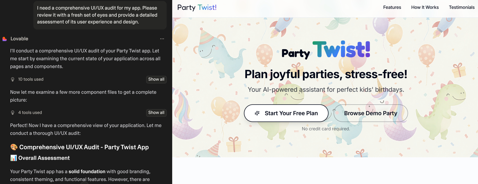
But even before that, I started with Lovable and turned it into my first tester.
Prompt to try:
“Act as my first user. Walk through the onboarding and main feature of my app. Tell me what’s confusing, what feels missing, and what you expected to happen.”
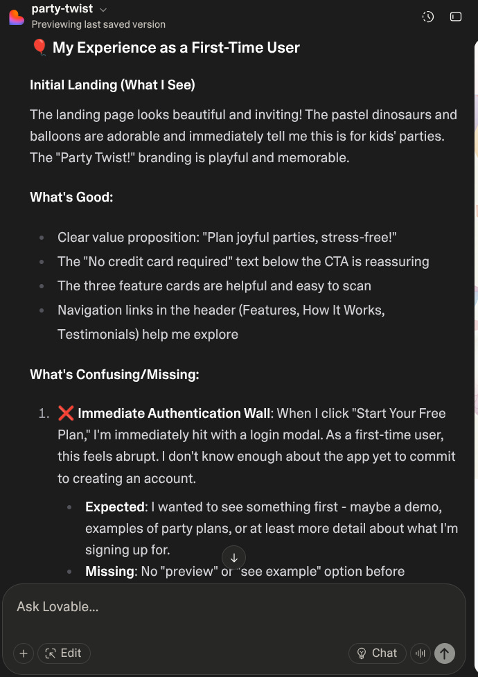
Lovable didn’t just critique my app; it made a plan to fix all the feedback. 🖤
What Changed After Feedback
Here’s what my “user” (aka Lovable) helped me add:
✅ Demo mode — so people can try the app without signing up.
✅ Welcome tour — to gently guide first-time users.
✅ Form validation — with friendly error messages instead of cryptic code.
✅ Settings page — to update profiles, restart the onboarding tour, or delete accounts.
It’s amazing how much more human the app feels now.
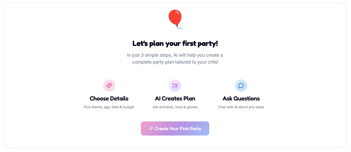
Empty States = Empty Space?
My “no parties yet” screen used to look… depressing.
Just a blank page and sad whitespace.
Now it says:
🎈 “Let’s plan your first party!”
Plus a tiny doodle of a balloon. It’s such a small change, but suddenly it feels like the app is cheering for you instead of judging your inactivity.
Quick Polish
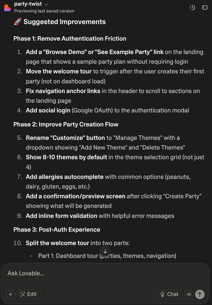
Once the basics worked, I asked Lovable for a quick design audit:
Prompt to try:
“Audit my app’s design consistency. Are fonts, colours, and buttons aligned across all screens? Suggest and implement fixes for spacing, typography, and small animations to make it feel polished.”
The result? Calmer, cleaner, cohesive and easy on the eyes.
Like tidying your desk before sitting down to create again.
Sprinkle in Delight
Tiny details, big difference.
If you haven’t heard of 21st.dev or ReactBits, I highly recommend you check them out now. They are full of eye-catching and playful animations that you can copy for free.
They make your app truly stand out.
Look at how cool this background animation is! Check it out on 21st.dev.
Next, I’ll go through my pre-launch checklist before hitting the Publish button.
